Character Design !
Drawing with Various Styles:
Within the lesson we were tasked with drawing ourselves in a minimum of 3 different styles (our own, an existing and a contrasting existing). It gave good practice on how to translate a character into say a more simpler style or a style known for having a certain style of fashion or anatomical changes, allowing you to think carefully and learn how to take elements from something without tracing it entirely.

First style: your own style
This was my first drawing and so I felt a little bit rusty when drawing it, therefore slightly dissatisfied with the overall result. I revisited this style after completing the other two necessary styles.

The revisited version I did in biro pen instead as that's usually the medium I tend to draw myself in when I'm doodling. I decided to make this version slightly bigger and only half the body as I think I didn't like the first because it was a little too small and the proportions felt a little squashed because of where it was positioned.
 .
. 
Style 2: existing style
This was probably my favourite to do and the one I spent the most time on. I did Kingdom Hearts' style (specifically the first game). I looked at various different outfits and combined different elements and looked into defining features of outfits (zips, straps, emblems, pockets, big shoes and pants, tiny top half stuff, wristbands and gloves). I did the same for the key blade, taking different elements from various key blades. If I did this again I might've added colour instead of just doing pencil as Kingdom Hearts is a very colourful game in general.
 .
. 
3: Another existing style that contrasts to the 2nd
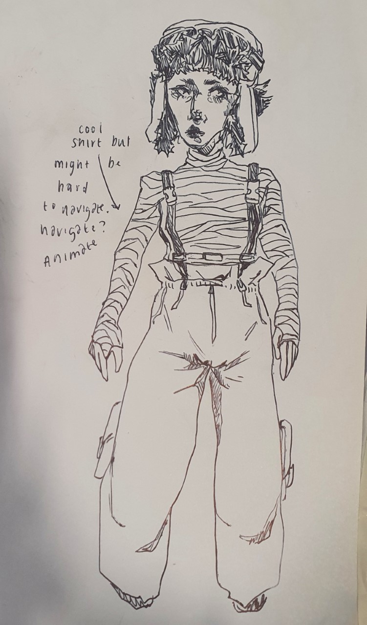
I decided after doing 2 in pencil sketch and doing quite detailed styles I wanted to try something completely different. Therefore I thought Adventure Time would be perfect ! (That and Amber also insisted everyone do one so we can all be in the same universe). When looking I think more accurately I would be a vampire in the show but I really wanted to give myself the funny hood Finn wears. I also think if I did this again I would try doing a bit more research to make my cat less of a re-skinned cake and more his own character. Apart from that I thought this style was super fun to do !
 .
. 
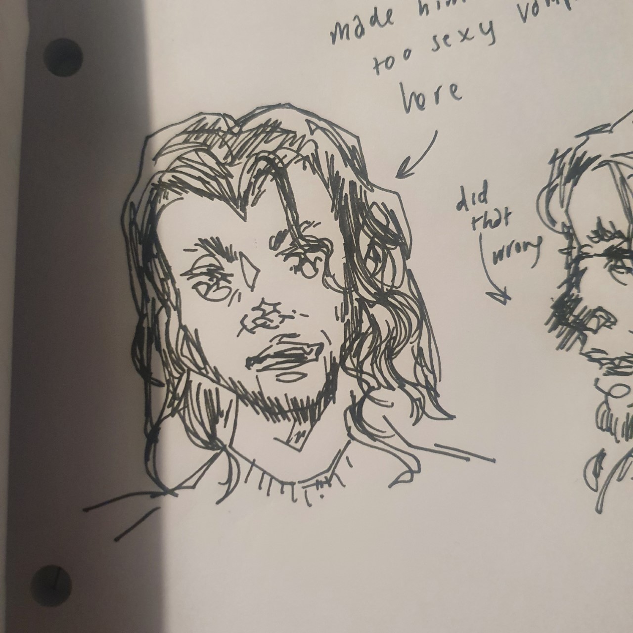
4th style: just for fun
I had some time to spare so I spent it drawing myself in some other styles I enjoy. For this one a very innocent version of Junji Ito's style, of who's I found quite difficult to replicate despite it not having mounds of detail to it. If I do end up doing a more fitting, horrified version I'll place it below:


Style 5: just for fun
For this one I drew myself as a splatoon character, just really simple and sketchy. If I was in Splatoon I would definitely be a full time Salmon Run employee and so I drew myself in their uniform without a splat gun as I am off duty of course. If I were to add to this drawing I'd definitely go full colour as that's what splatoon is all about.


Style 6: just for fun
Lastly in this one I drew me and my cat in the style of Animal Crossing, we both have Halloween costumes on ready for October and I noticed villagers are often given unconventional animal colourings so I made my cat blue because I think he would like to be blue if he was a villager. I love how simple and easy the animal crossing style is yet there's such a range of different looks to make everyone unique.
____________________________________________
Pin board of character design references:
No particular order, contains full body design specific parts of face and body design diff angles shapes and such.
____________________________________________
Characters in shapes:

The task was to draw completely random shapes on a page, pass it on to the person beside you and then come up with a character that fits within the confines of that shape. I managed to come up with 4 characters in the time we had, everyone voted the second shape (the clown) to be turned into a more detailed finalised version.

I decided since he had quite a wide face and a creepy face I'd lean more into that. I wanted to make him quite bulbous? And stubby in a way with a huge torso and little legs but huge clown shoes. Onto his jumper I added some stains as I wanted to emphasise a creepy and gross sort of demeanor, like you can imagine just by glancing that he probably lives in a dingy trailer park. I think if I had more time to create this character I'd add a pattern to either his jumper or pants to give an even greater feel to the fact he's a clown and not just I guy who's painted his face like one. I enjoyed this task as it really got me to think on the spot on how I can make a potential character in a short space of time with something so simple as a squiggle on a page.
Characters with generators:
For the second part of our session we were tasked with drawing a fellow classmate (chose for us) and draw them as a character within the specifications of three generators: one for genre, one for age range and one for style of media. I thoroughly enjoyed this task and found it so fun to not only challenge myself but see how others translated me into different worlds and genres.

One: A fantasy animation for adults
For this prompt I got tasked with drawing millie, which with her well known love for mushrooms, I don't think I could've got a better classmate to base this character from. I imagined her definitely dwelling within the forest, either as a fairy or pixie like creature or someone who uses nature-themed magic. I gave her a hat that resembled a mushroom cap and very floaty and bits of poofy clothing to also resemble various other mushrooms and witchy/fairy style clothing. I really liked how this design came out and I was quite proud that I was able to finish it within the time given.


Two: A space/ western animation for young adults
For this prompt I was tasked with drawing Amber, which initially I thought was going to be a struggle but as I got more into the drawing I actually realised how easy it was to translate a lot of the clothes she already wore in real life into a more cowboy inspired get up. I envisioned Amber being a confident and sassy lone bounty hunter, to which I tried to emulate through her pose and flashy clothing (fur coat, flares with big stars on, chunky platform boots and of course a big cowboy hat with a matching belt).

Three: A fighting game for 6-11 year olds
This was the third and final prompt upon which I was given Harry as my character base. I wanted to challenge the description of a fighting game, as I wanted it to be unique rather than "here's two heavily buff guys battering each other until one falls over", therefore I settles with a boogie fight. I thought it'd be quite funny to imagine Harry dancing and I knew the only opponent fitting for him was a monkey. I made it quite cartoony and colourful as it was for a younger audience but still tried to make it appealing to the older side of the scale. I found this fun to do and liked being challenged to alter my style to fit the target audience and media.
Extra: supernatural animation for 6-11 years.

____________________________________________
Interesting video:
The Other Mother Costume Progression
I came across this video on YouTube and thought it was quite interesting and relevant in relation to the sessions on character design. Deb Cook, who worked on the costume designs for Coraline explains in depth and detail how she made each stage of the Other Mother's outfits within relevance to how her body transforms and evolves as the story unfolds. I thought this was really useful in regards to thinking about how you can subtly add elements that actually tell alot about a character and their role in the story. It made me have the realisation about what the symbolism for the Other Mother was and how clever it truly is.
____________________________________________
Name based character task:
In the session, we had two wheels spun for a first name and a surname, to which we'd have to build a character from by how their name sounds. My name given was "Summer O'connor" I originally got the surname Smith but decided to change it for that name already existing in the Rick and Morty universe. The first thing that came to mind was summer being quite a bubbly social name and I invisioned a early 2000s mean older sister. With O'connor of course it is an Irish surname and so I wanted to make her a part of the traveller community as I thought it fit the aesthetic I had in mind and I haven't really seen many traveller representation in animation so all the more reason.

This is the first mood board I made to give me a real feel for what I was going for. I looked at traveller videos on tik tok as Pinterest banned the word 'gypsy' from searches and traveller girl was coming up with strange Texas farmer girls? However Pinterest did serve me well when it came to looking at early 2000s "Bimbocore". Some Celebrity inspirations include: • Paris Hilton
• Lindsay Lohan
• Gwen Stefani
• Britney Spears
I took inspo from Strix with their idea of using songs you think your character would listen to or songs that sound like how you want your character to be perceived. I thought summer would be too lazy to make a playlist herself & would use someone else's :
playlist
Existing characters to take influence from:


Jessica, also from Until Dawn is another great character to draw inspiration from. This time also appearance wise in some ways and personality wise. In the Voice actor's words: "Jessica is... she has a whole lot of personality. She is definitely the sort of mean girl character that, y'know, at school she knows she's pretty, she knows that boys like her, and she is going to use it to her advantage.".
Story wise : her life is completely normal until a famous food company are responsible for a harmful chemical being input into their product infecting people and causing similar effects of the Leucochlouridium, a worm that infects snails and takes full control of their eyes and parts of the brain that determine things like movement basically making people mindless with a sole task of making sure they infect the rest of humanity until there is no one left. Was it accidental or was this the company's plan all along ? One things for sure Summer doesn't really fancy being a mindless puppet; she's dumb but not that dumb. Due to such circumstances she now has to quickly adapt from her superficial, materialistic lifestyle to complete survival.

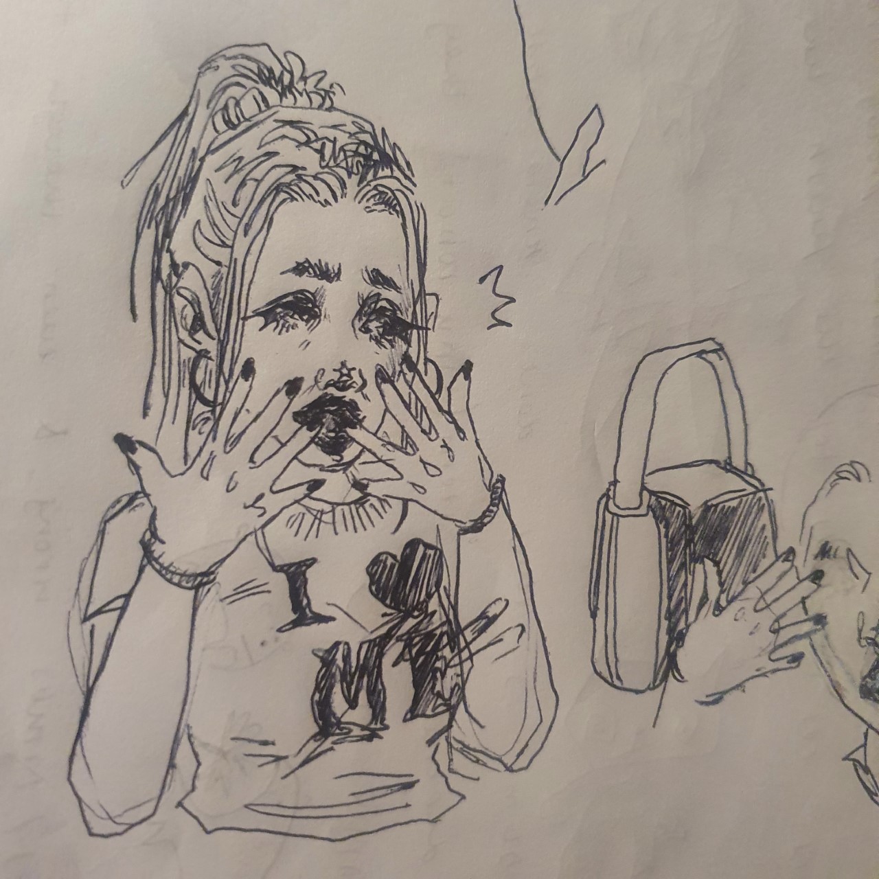
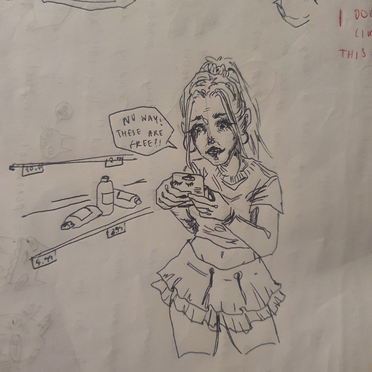
These were extra sketches I made of Summer adjusting to the early life of the apocalypse. She's very excited to discover everything is suspiciously free of charge.

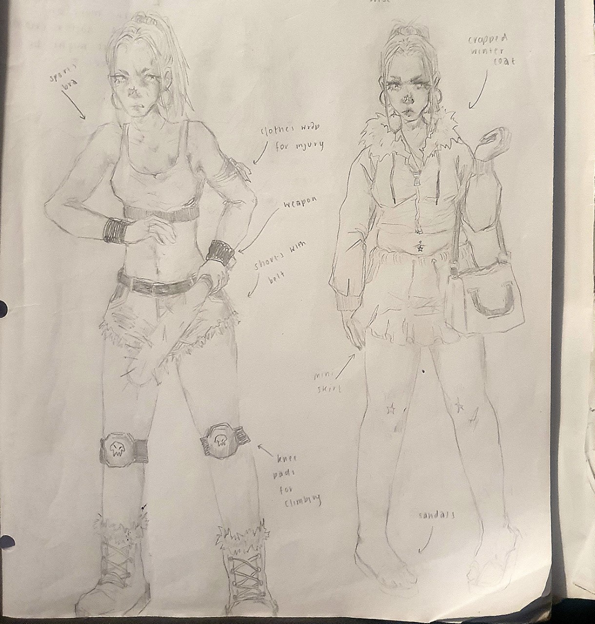
References for finalised illustrations:


Finalised illustrations:


(text taken from backstory paragraph)
____________________________________________
Good existing character design:
Although I talked about this with a video previously further up, I didn't completely go into detail about why her character design is so clever so I thought this task brought a perfect opportunity to do so. First off, the other mother is linked to insects, having an entire room dedicated to them. Throughout the story she slowly transforms from who she is posing as to her true self: like insects tend to transform from larva to flies or caterpillars to butterflies. This is seen through the peplum on the back of her skirt protruding out more and more her becoming more elongated and pointed in structure and then finally even gaining limbs. I think however what's the cleverest part of her character design is that her true form represents a spider, this is implied with the scene where she turns the floor to a Web. Such a creature is fitting as she likes sewing: she has needles for hands, she makes the dolls that lure children to her world, she wants to put buttons in their eyes and most importantly, she crafts a world in which everyone is a puppet controlled by her and when the world falls apart it unravels like thread.


I also wanted to talk about the designs for Silent Hill 2 as they've always been one of my favourites. As far as symbolism and representation goes with this game the monsters are manifestations of peoples guilt, negative emotions and things along those lines. For James Sunderland, the character we play as, he comes to Silent Hill after receiving a letter from his deceased wife of 3 years. Immediately we can tell his entire trip is out of guilt (either that or he's loopy) as we find his wife was terminally ill before she passed.
The monsters above each represent James' repressed feelings during his wife's illness, most having some sort of sexual connotation to them. The first monster almost appears as though its wearing a straightjacket and walks around blindly, possibly representing how James almost felt like he was trapped within his marriage during her late moments and him being blindsided by his own selfish needs whilst his wife suffered. The nurse is just a very sexualised version of a nurse, likely a reference to the doctors and carers that would visit his wife. The leg monster is another reference to his sexual frustration, they're quite literally two pairs of female legs sewn together and there's even a scene where pyramid head can be seen having his way with one of these creatures.

Even further on this point, Maria, a character you encounter on your journey looks exactly like James' wife and is even named eerily close as his wife's name was Mary. She's dressed in a more revealing way and acts promiscuous throughout, pushing that narrative that James wished Mary his wife was more sexual with him when she was ill, which to me Maria's design is the most haunting because she isn't even presented as a monster she's just there to remind him of the terrible person he is for expecting that of his dying wife.
Bad existing character design:
Ryuko and Satsuki junketsu designs from Kill La Kill.


Ugly character design:

My example for an ugly character design is the baron from Resident Evil 8. Without being in any way negative toward larger people, he is off-putting because of the excess of weight, almost unnatural. He looks like the definition of gluttony, the way his stomach hangs low out of his shirt staring at you and he is constantly eating with his hands. He's a nice guy though.
Examples of shapes in character design:

Examples of colour use in character design:

Colour plays an important role in character design, surprisingly you can tell a lot about a character from their colour scheme. Primary colours, red, blue and yellow, usually signify a good character or a hero, whilst secondary colours, orange, green and purple, usually signify a bad character or a villain. There's also tertiary colours. Complimentary, split complimentary and triadic can all be used to make nice contrasts within a character or their clothing. My example would be Cuphead and Mugman, they are both predominantly made up of primary colours (red and blue), signifying they are the good guys and both of them being within the same colour band lets you know they are connected/a duo.
Creature mashup character design:
We were given two halves of an animal card to create a brand new hybrid creature of the two. I was given a tigers head with a crocodiles body.

I picked a slender nosed crocodile as it had stripes similar to a tiger.

I noticed that both animals were stealthy predators and so I took that into account when mixing the two, low to the ground to avoid being seen and those same tiger stripes in a more muddy/earthy tone of a crocodile (not able to be seen from my drawings but the thought was there). Webbed crocodile feet at the front and and feline tiger paws at the back to have the best of both worlds: swimming and speed. My favourite part was making the tail in which I gave the of a crocodile's but the markings of a tiger's. I wanted to incorporate the teeth of a crocodile into the tigers face (built in the structure).

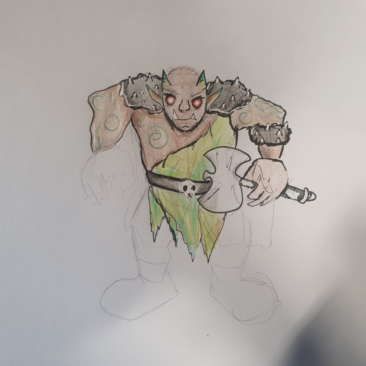
Duo task: working at weaknesses:
For this task we were paired together with our opposites in the class, I was paired with Millie because, whilst Millie was good at planning everything before getting it down all perfect on paper. I was the opposite and don't plan much, just going in straight away with a full drawing. We had to draw a medieval troll, create a quick sketch for each other, swap over and line and colour each other's rough sketch. I struggled at first in visualising the form on a basic level but eventually I got there, then when we swapped I struggled a little to then visualise a new troll within a design I did not create. It was fun however to try it out and end up with something I wouldn't normally draw.

One minute narrative: Characters
Experimentation:


One of the main things I like to get right with my characters is their hair, the way someone's hair is styled or cut can tell you a lot about the person. I tried both simple and more complex hair choices trying to keep the vibe that they're meticulous and a tad eccentric. I went for number 2 because I thought I could weave wires through their hair and other bits of hardware from fixing and tinkering with things.


I drew out a more detailed version when it came to the final versions. It also allowed me to start thinking about colour schemes, their clothes were still in early development, as seen by Fisher's clothing not being exactly what he wears now in his final form and Rover's skintight being a little lighter than what I gave him in the end.


(Pinterest board for inspiration: inspo )
These were the different ideas for clothes and accessories, I knew I wanted very post apocalyptic/ army surplus sort of clothing as they're dressing for survival.

Fisher was either going to have a welder's mask, a pilot hat or vintage welder goggles. I decided to go with the welder goggles because his hair is a big part of his character and I didn't want to distract from it and I also wanted you to be able to see his face, so you can tell his expressions.


The only reference used for 3.14, a pie top so I could figure out how to make his pie top because drawing weaving is hard of the top of your head.
Turnarounds:


This is the final version of Rover, I made him quite bulky to show his nature of of working is partially due to his stature. Unfortunately, my dark blue pen was running out and by the time I realised, it was too late to turn back. I made sure his colour palette was darker overall compared to Fisher's and both turnarounds consisted of a front, side and back with a 3/4 face and two expressions. I had a lot of fun doing these and getting to draw what they look like on every angle, as it's not something I always think to do.
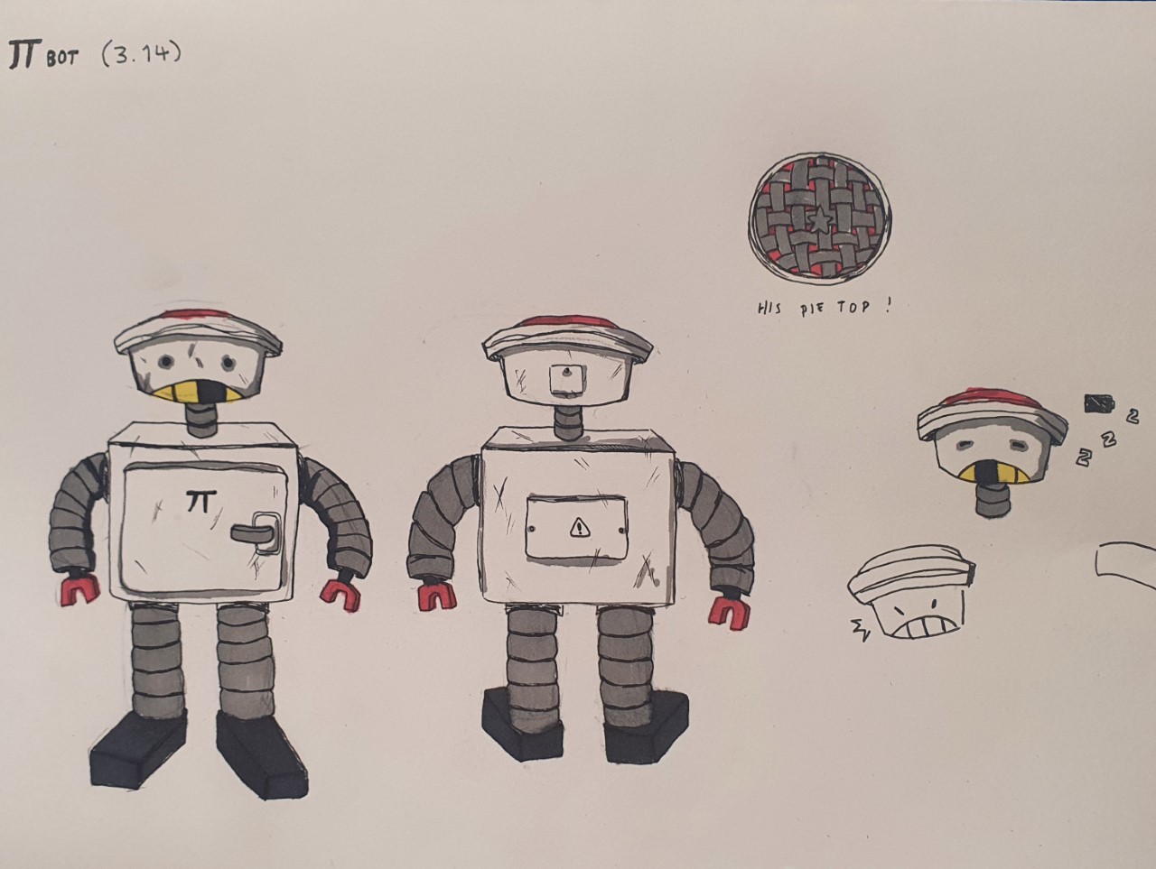
This is a quick turnaround I did for my robot, 3.14 (haha... cuz he makes pie...) I only did the front and back, with a view of the top of his head. He's pretty much symmetrical, there are scratches on him from wear and tear and I included a view of his back panels. The top of his head looks like a pie because his head is pie shaped to fit with the theme. His teeth also would light up and sort of randomly light individually when he's talking, if he's charging they'd light up like battery bars. I gave him little red claws to match the red on the top of his head.


Evaluation
Throughout the module I have learnt a lot about character design and the thought process that goes into a character, from their colour scheme to their shape and what those things can suggest about them. I enjoyed this module a lot as one of my favourite things to do within art is creating different characters and this module especially allowed me to create characters in styles I wouldn't usually do in my own time an create certain characters outside of my usual taste. My favourite part of the module was the random generator tasks, as it was fun to think about what a character would look like based on vague elements like a name or a genre, having to work on the spot to create them which is good practice for when we're released into the working world. If I had a least favourite part it would probably be the working to weaknesses task, mostly because even it was made to be a struggle, it was still a surprising struggle but it allowed me to work through that weakness and adapt to get the job done. I'm definitely going to take everything I have learnt in this semester into future modules and hope they bring improvement to my characters.

Comments
Post a Comment