Story Craft !
Comic Comparisons
For my three comparisons I chose a manga, a graphic novel (composite) and a comic.
One: Gyo (Junji Ito)
This book wad the first ever Junji Ito book I read and it was the one that got me hooked on his work. Out of the three works I chose, this is the only black and white body of work. Almost all manga works come in black and white, however I also think this serves well in terms of it being a horror as the monochrome appearance almost sets the mood where I think colour wouldn't be able to.


Two: Bee and Puppycat (Natasha Allegri)
Within this collection of short stories there were quite a lot of standard square panel layouts with little variation in shapes and how the story read which isn't a bad thing but I wanted to find something that stood out to be able to compare. However I did end up managing to find two pages that completely stood out and broke the mould for a traditional story layout:


Three: World War Tank Girl (Martin&Parson)
This comic compares to the graphic novel as there wasn't much varying composition within throughout apart from a panel without a border here and there. In comparison to the graphic novel it kept the same style throughout like the manga example. The tones of colour used was more earthy in comparison to the graphic novel where lots of bright and pastel tones were used throughout.

Comic: my typical day:
For this, we had to create a one page comic on what a typical day for each of us looks like. For me in particular I chose a day when im at uni then work, as that's the most common layout of a day for me. I wake up, usually before my alarm, I get dressed and get ready, I head out to catch the train to uni, do uni work, go to work,get home late and fall into bed. I kept it fairly simple and cartoony, as I wanted to be able to get it out quick, and maybe portray the franticness of my day through a scribbly sort of style. I decided to have a cool transition on the train of one side being where I get on and the other being my destination. A few of the panels include multiple of me, to summarise a few actions that are happening in the same place, that I felt all held relevance. I also used the door in the bottom left panel as a sort of breaker.


Extra comic:
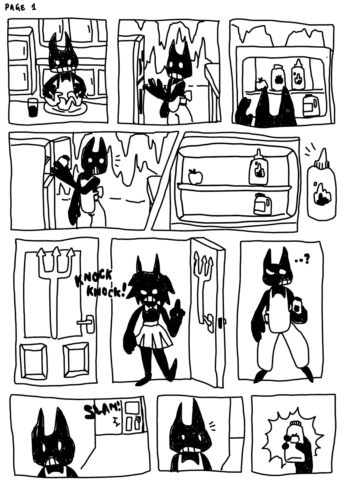
This was a little extra task set to me andStrix, to work together in telling a short story, making it into a comic consisting of two characters, each telling their stories separately from their points of view and converging them along the way. We chose to make the story about a little demon who mistakingly grabs the wrong sauce from his fridge due to being distracted by a knock on the door. That knock is from an individual queering if the demon's refrigerator is running, within that time hearing the backdoor slam. His fridge is indeed running and he better go catch it. I didn't have time to complete this comic, but it would've been nice to as I had a lot of fun creating it and I wanted to show wen our stories would converge together. Maybe sometime in the future I can revisit it.
_______________________________________________________________


I'm not heavily familiar with a lot of single page comic strips, however I did realise there were a bunch of Garfield strips I could find that did do exactly that in the confines of 2 to 3 boxes. The format is primarily joke telling, the first panel usually being the set up and the second or third panel containing the punchline. I think they work really well as they're short, sweet and very abrupt which somehow makes them even funnier. I also looked at Creepy Cat, a book filled with single page comics about a goth and her sinister cat, they are also pretty funny.

(My attempt at a limited panel comic)
It's just a funny little joke about vampires and being lacking of a reflection.
______________________________________________________________
Existing Stories I Like:

The Story in the best way I can remember it,(1) takes place 2 years after events within the first game. Marie comes back from a visit to her parents to discover not only has the great zapfish that powers the entire city has been stolen, but so has her sister Callie. You're recruited as Agent 4 from the Inkopolis square to fight the evil Octarians who're thought to be behind the kidnapping by Marie (Agent 2). (2) You fight your way through various locations, defeating Octarians and recovering stolen Zapfish. At the end of your journey you discover that Callie has in fact joined the Octarians. This is because she has been brainwashed by DJ Octavio. (3) Marie manages to break Callie free from her brainwashing and the both of them assist you in defeating DJ Octavio. You return the great Zapfish back to Inkopolis and the sisters to reunite and resume their musical career. Oh and you get to keep your uniform ?
I enjoyed this story because when you're playing it level by level you really feel the struggle and the length of the journey to get you to that final point to which you need to take down the big boss. It's everything you've been training and working up to. You anticipate what Callie's fate will be at times even question if you can defeat DJ Octavio. Then the relief when all ends well, peace is restored and your job is done. It's a nice lighthearted game that I think a lot would enjoy if they played it.
Storyboard:

Existing storyboards

I like this set of panels because of how vividly you can imagine the scene happening. There's the angry mob, then the close attention to Norman's parents looking at each other, then in front, then screaming to show the anticipation and build up to Mrs. H appearing in front of them armed and angry.

By the appearance of the rooms it looks as if they used blank 3D models to plan everything out, in some places drawing over the panels to signal camera or subject movement and various firing and explosions. I think it's very important for a game like Call of Duty to have detailed storyboards as there is so much constantly happening all around and its good to keep a track on where it will be, when it will happen and how much will happen at once.
Existing animatics
Steven Universe: Other Friends animation.
What I noticed about this animatic is that it's quite detailed, in terms of illustration and frames included. In the animatics we did in class, we used our storyboard panels, that only included the most important actions of the animation. I really like the movement with the spiral limbs and the bouncing about within the animation, overall this animatic is very clean in movement and appearance and it's nice to see it side by side with the final animation.
Photo-bashing
For this task, we had to create a collage of online images for each other's backgrounds for the one minute narratives.

For this I took a sparse edge of a woodland, added a direction post and an electrical pole (for missing posters to be put on). I also added shrubs and darkened the image to add that spooky atmosphere.

For this one I found an abandoned mansion with a nice open composition with room to play around. I added a table and some dead flowers near the stairs. I also added some doors here and there, and sme greenery in one of the doorways.

I took a nice image of a sparse, decaying graveyard and added some more gravestones to fill it out, some shrubbery and a mausoleum as a sort of meeting spot for the two ghosts. I also darkened everything for the spook factor.

This is what I envisioned for my character's humble abode. It consists of lots of random junk that's been salvaged over time. I used full buildings of miniatures people had made and a fast food statue in the foreground. They live in the desert probably in America, I took inspiration from Fallout's various shelters.


Amber's sinister forest/woods:
Ricky's abandoned mansion:
For this one I found an abandoned mansion with a nice open composition with room to play around. I added a table and some dead flowers near the stairs. I also added some doors here and there, and sme greenery in one of the doorways.
Strix's romantic graveyard:
I took a nice image of a sparse, decaying graveyard and added some more gravestones to fill it out, some shrubbery and a mausoleum as a sort of meeting spot for the two ghosts. I also darkened everything for the spook factor.
My wasteland !
(This is one Strix made for me!)
Harry's medieval tavern
This was my least favourite to do, as it was surprisingly difficult to execute. I accidentally used an image with a giant watermark but by the time I wanted to change we'd already had half of our time, I added chandeliers and a picnic bench. Then I unfortunately ran out of time.
A story I like
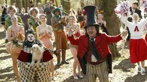
I tried not to choose Silent Hill 2, although one if not my favourite story and game, as I've already chosen to speak about it in a previous task. I also couldn't choose Last of Us for some obvious reasons. Instead I went for a movie: Bigfish. It's a story about storytelling, in a nutshell. I used to watch it all the time when I was younger because I loved the whimsical and mysterious characters and places that it was filled with, like the almost cultist looking town or the siamese twins from during the war time. The element I think that made this story a successful one would be the emotion. A story can have cool looking characters and a great atmosphere but I feel like it's wasted if you cannot connect with the characters and the story being told. The emotion in this story for example is the strain between the son and father relationship because the son feels all his father says is lies and exaggeration even on his death bed he seemingly cannot stop telling tall tales. all the son wants to do is figure out the mystery that is his father and separate fact from fiction.
Main task: One Minute Narrative
Script and Storyboard:
Before even beginning our storyboard, we had to have a story. Brainstorming, I came up with two ideas. one of them was going to include an amateur racer who wants to impress his crush by going against the biggest racer in town in a drag race, an idea I liked but I was told never to settle on your first idea so instead I developed my other idea a little further. Two friends, polar opposites, find a robot and work together to fix it however, along the way their differences cause a rift. The two must eventually learn that they need each other's skills to succeed. This was the idea I went with as I felt I could mould it to the three act structure a lot better. We then had to create a script, helping to visualise how we would set the scene, what our characters would say and how they would say it and also to structure the three acts clearly knowing what will happen t lead to each act.


From my script I was able to figure out just how my two characters would be opposite to each other. Fisher would be the shorter, neater character who's more delicate and meticulous with their approach and Rover would be the bigger, buffer character who's a little rougher and less careful with their approach. On my first draft, Andrew pointed out that I was missing a clear point where we could see the rift take place and the sort of resolution taking place (an apology or realisation). I fixed this by describing how Fisher was watching Rover work and getting more and more irritated as he went on, leading onto the burst of "I'll do it myself". The resolution was just simply a line where Fisher admitted there are positives to Rover's style of working. After I was happy and Andrew was happy, it was time to draw it out.


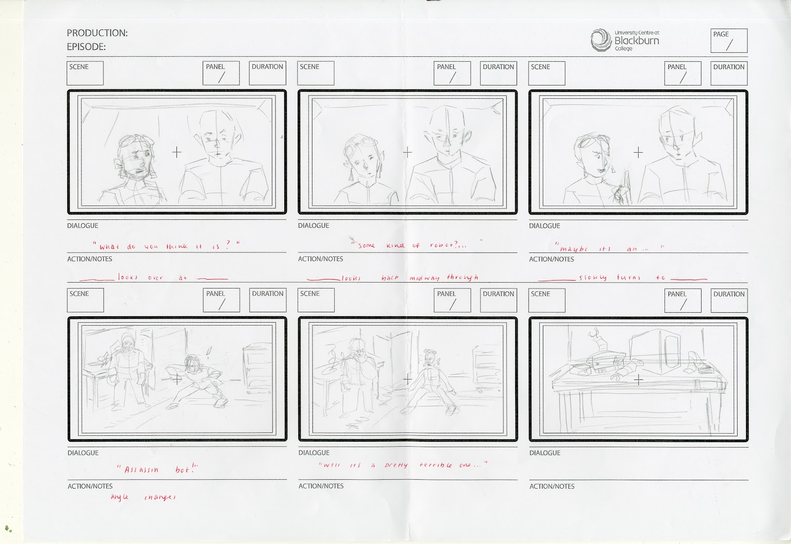
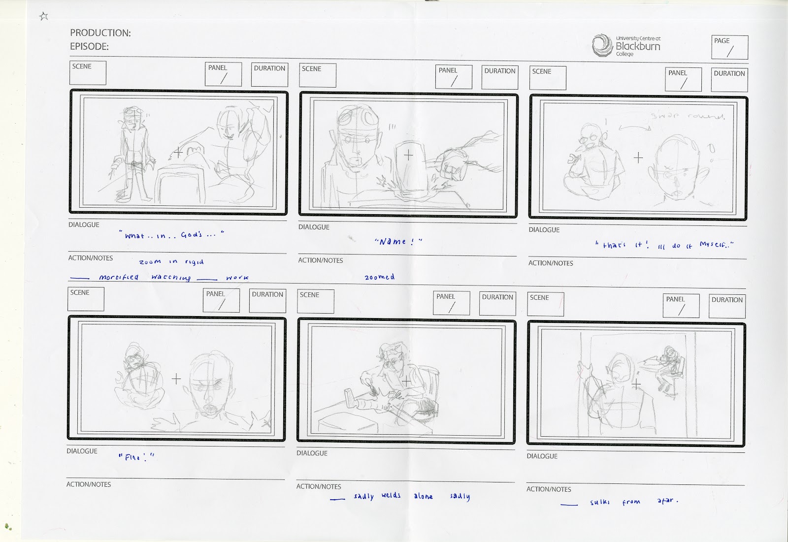


I had a lot of fun drawing out the storyboards, as it helped me out significantly with working out the composition of everything and move from the vague idea of what scenes will look like to a clear image of what it will look like. I kept everything quite sketchy to get it out fast and made sure I didn't focus to much on details for the moment.
Animatic:
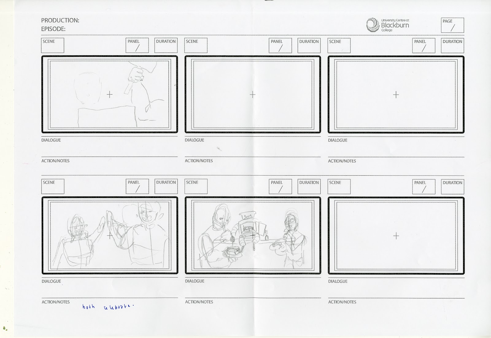
The animatic was where my work went from pretty quick and streamline to a tedious yoyo. Maybe up to my own foolishness but when it came to importing my frames into Premiere, I had to save each panel as an individual file on photoshop. Unfortunately, all the panels saved at 12000 x 24000 pixels. I had to resize all 38 of them. One at a time. *sadly welds alone sadly*. After the completion of all of that, you'd think I'd be good to go; I was smitten once more. 7 panels didn't want to import themselves and so I had to remake them, only to find upon closer inspection that a few of them didn't even compositionally or chronologically make sense. Luckily with a little flipping, clipping, swapping and drawing over they were all sorted. Finally, I could time them to fit to the one minute goal and I even added a little movement to one of the panels just to try it out and add some fancy crossfades here and there. Then came to giving my characters voices. My victims ended up being Nathan from the third year: for Fisher as I felt his voice matched the sort of ambiguously gendered appearance I gave Fisher. Then Mark for Rover, mostly because I thought it would be funny to get Mark to voice something but also because it needed a loud, manly voice to match his bulky appearance. Nathan gave Fisher a posh voice to compliment his neat personality and Mark gave Rover a contrasting loud, thick Northern accent. After adding some sound effects from free sfx and I had a fully functional animatic. Despite the tedious struggles, I still enjoyed creating it and was proud to finally see its completion.
Animation:

The final step was to animate everything. Unfortunately, I didn't have a large time frame to work with, approximately four days spread over two weeks, but I wanted to have a go nonetheless. I decided to animate the scene where they are both quietly (or not so) working away fixing parts of the robot. I made sure to at least get one snippet of each of them working, it's not anything fancy but it's progression from last year's work in terms of detail of the characters.
Evaluation
Throughout this module, I have learnt a lot about the process of creating a final product, whether that be an animation or a game cutscene or a film or an advertisement. It was refreshing seeing the early stages of them, as it helped me realise not everything is perfect right off the bat and that there are mistakes and early sketches. I also learnt a lot about how to make a good story, the structure they follow and the elements they should include. It was also fun making comics and learning about how they decide the panel shapes as that's something I originally could't really figure out. My favourite part within this module was probably the storyboard. It was quite relaxing to step back from doing heavy detail and purposely create simple, messy sketches whilst also creating a visual that tells your story clearly, as sometimes it's hard to picture what would unfold in a story when it's just writing. My least favourite element of this module was unsurprisingly: the animatic. Not because it wasn't entirely to my taste, but because it was very tedious with the saving of individual panels and importing and exporting and timing and so on. However, it was rewarding to see when it was finally complete. I will definitely try to take the skills I have learnt in this semester and attempt to apply them in future modules.


Comments
Post a Comment